


ALL >> Web-Design >> View Article
3 Classic Corporate Logos We Wish Would Have Stayed The Same


Everywhere we go, we see corporate logos around us. In fact, they have become a part of our day-to-day life. We see them everywhere, whether online or offline. Each logo has its own meaning and importance that they try to represent. Several businesses have had the same logo since the very beginning while some have changed it over the years.
Obviously, a business can change its logo if it feels it is needed. And it really doesn’t matter whether it is one of the top classic corporate logos or a new one. But there are some corporate logos that we feel shouldn’t have been changed.
In this post, we bring to you a list of some logos that we think were perfect and shouldn’t have been changed.
1. American Airlines
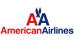
When you get a logo designed by one of the famous names like Massimo Vignelli, you would want to hold ...
... n it for as long as possible. And to be honest American Airlines held on to its logo for about 46 years. But in the year 2013, they demanded a redesign of one of the most brilliant classic corporate logos ever created.
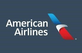
The new logo was designed by Future brand, and undoubtedly it is amazing. The logo had some elements in it that were inspired by the original one like using the same colors along with the eagle. But you can go ahead and callus sentimental if you wish, but we miss the bold and powerful look of the original logo.
2. Black & Decker
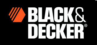
This is another logo that was loved immensely but was changed later. Black & Decker which is a famous hardware company came up with this amazing logo back in the year 1984. The logo was known for its unique nut-shaped icon and bold font.
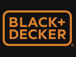
The company came up with a new logo in 2014 which was created by New York Consultancy Lippincott. The new logo looks nothing like the original one. Only the name remains and the ® mark has been added with similar color usage. Undoubtedly the new logo has its own beauty of being sleek and having a modern look to it. But the new logo will be more suitable for clothing brands or internet businesses. The power seen in the original logo appears to be missing from the new one.
3. Kraft
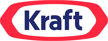
The story behind this logo can be quite confusing. Kraft Foods had one of the most incredible classic corporate logos the world had ever seen. The logo mentioned above was used from 1988-2012.
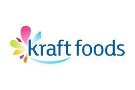
In the year 2009, Kraft Foods Inc the corporation, not the brand, came up with a whole new logo that had nothing in common with the original logo. Surely, the new logo was good enough but Kraft kind of lost its feel. The new logo appeared to be something that would have been more suitable for the Olympics probably. But in 2011, Kraft Foods Inc. announced that it was going to split into Mondelez which will be a snack business on the global level, and Kraft Foods Group. The former got itself a new logo while the latter kept its original logo with some minor changes. And the confusing colorful logo was gone.
If you are looking to make changes to your current logo in the best way without making any mistakes, contact Digital Polo. We have a huge experience of creating incredible corporate logos.
We as a graphic design agency are pioneers of the concept of Unlimited Designs for a Fixed, Low Monthly Fee. Our objective is simple. If design is not your forte, then you should not waste time on it. That’s why we are here. To get all your design work done so that you can focus on your core operations. We provide unlimited high-quality design work for just a minimal, monthly fee. Not only that. We also provide unlimited revisions. Lastly, we take pride in our ability to deliver all work in as less as 48 hours.
Add Comment
Web Design Articles
1. How Gsc Fatoorax Reduces Zatca E-invoicing Costs For Saudi EnterprisesAuthor: Andy
2. How Web Design & Development Affects User Experience?
Author: Optimist
3. Driving Digital Growth In The Uk With Wordpress Development Expertise From India
Author: Sanjeevani Nair
4. Real Seo Vs Fake Seo Reporting: The Truth Every Business Owner Must Know
Author: sochtek
5. What Are The Benefits Of Hiring Top Dental Website Design Companies For Clinics?
Author: PSM
6. Why Your Business Needs A Shopify Development Agency In 2026
Author: Devis
7. How Indian Businesses Are Building Mobile Apps For Long-term Growth
Author: digittrix Infotech
8. Digital Marketing Company In Noida Delivering Result Driven Strategies For Modern Businesses
Author: Digital Notebook
9. Google Business Profile Optimization Checklist For 2026
Author: sochtek
10. Best Website Designing Company In Dubai | Professional & Custom Web Solutions
Author: GlobosoftSEO
11. Revolutionizing Communication: The Whatsapp Clone By Omninos Solutions
Author: BY Omninos solution
12. Seo Vs Ppc: Which Brings Better Roi For Small Businesses In 2026?
Author: sochtek
13. Hire The Best Vue.js Developers In Riyadh For Your Applications
Author: Andy
14. What All You Need To Understand About Website Design And Development
Author: Liam Mackie
15. Drupal Web Development Services In Riyadh For Strategic Growth
Author: Andy